Venue.sh
2024
Designing in-app notifications for Venue.sh
As Senior UX Designer on Venue.sh, I led the design of the in-app notifications experience - a bell-and-panel system in the global shell that surfaces what changed in the portal since you last visited, without adding another channel developers have to monitor. The work spanned notification types, header placement, unread states, and granular preferences (email, in-app, announcements) in Settings, balancing signal over noise for daily users and broadcast control for platform teams.

Overview
The portal should tell you what changed, not make you go looking
I treated notifications as part of Venue’s single pane of glass, not a separate product. The design goal was to close the loop on in-portal events: scorecard failures, template runs, import completion, assignments, and platform announcements, surfaced where users already work, with a clear path to the underlying entity. Success meant fewer “did you see…?” Slack messages and a credible complement to the Home “since you last visited” activity feed, without competing with the Assistant or global search for header attention.
Problem
Important updates were scattered, easy to miss, and hard to control
The redesign focused on improving clarity across the dashboard through better hierarchy, cleaner spacing, and more visible transaction details. The updated experience made everyday financial workflows easier to scan and navigate while introducing lightweight interactions that surfaced more context when needed.
Research
Not everyone wants the same interruption
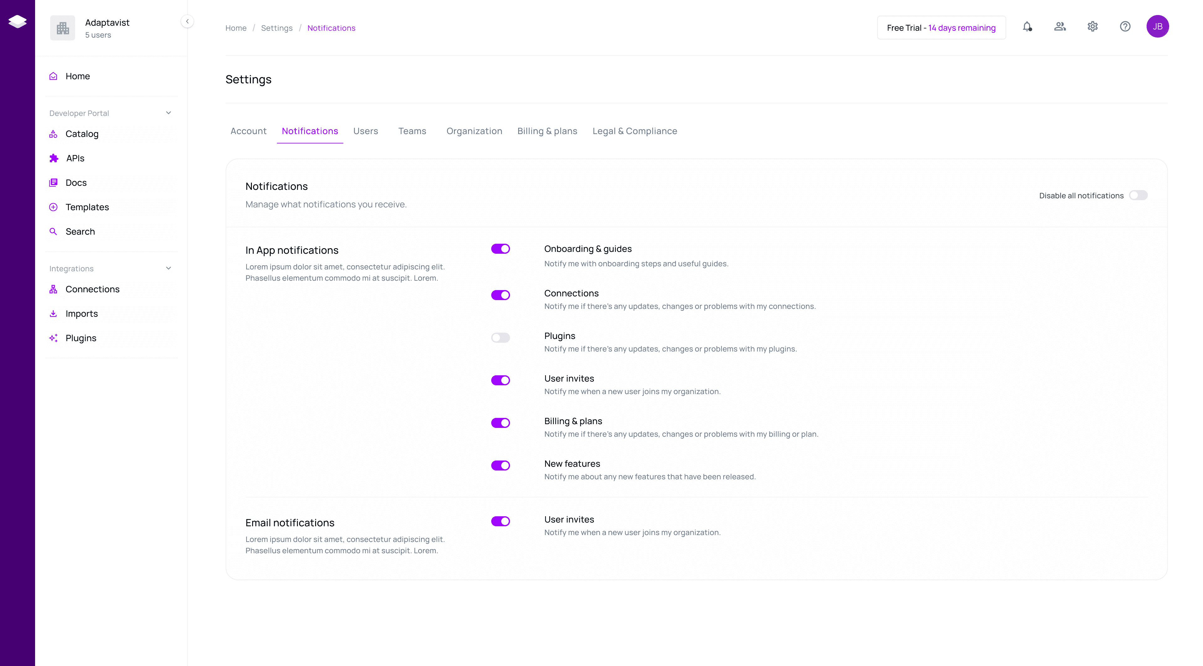
I mapped notification needs across personas: Developer Don wants actionable, entity-linked updates (ownership changes, template outcomes); Manager Mel cares about team scorecard movement; Platform Engineer needs to send announcements and avoid becoming a human notification router. Journey mapping surfaced tension with existing surfaces ; Activity Log is audit-oriented, email is async and easy to ignore, Slack is where noise already lives. The design insight: in-app notifications should be event summaries with deep links, not a second inbox, and preferences had to be first-class, not a post-launch afterthought.
Designs
Shell-native, scannable, and quiet by default
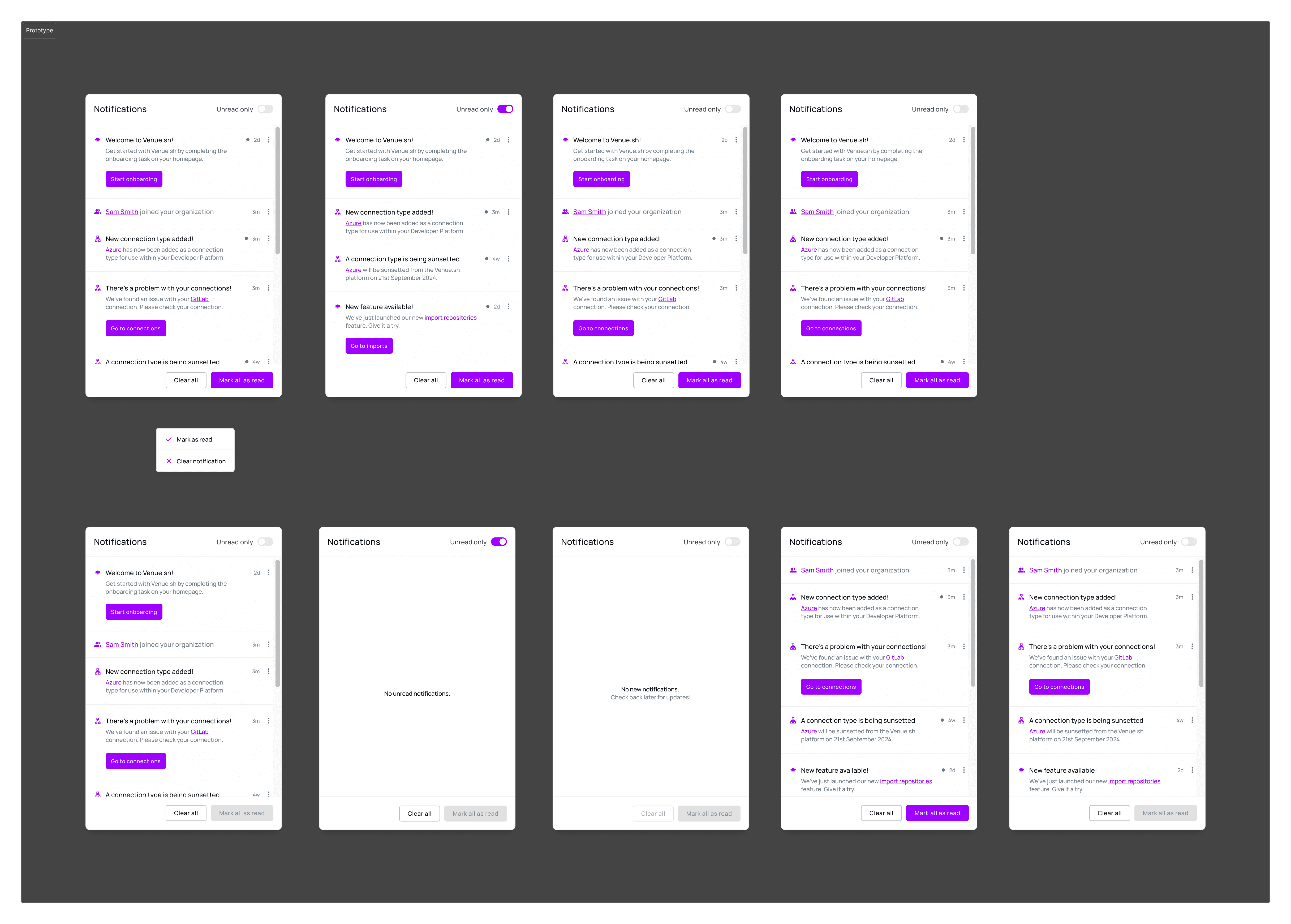
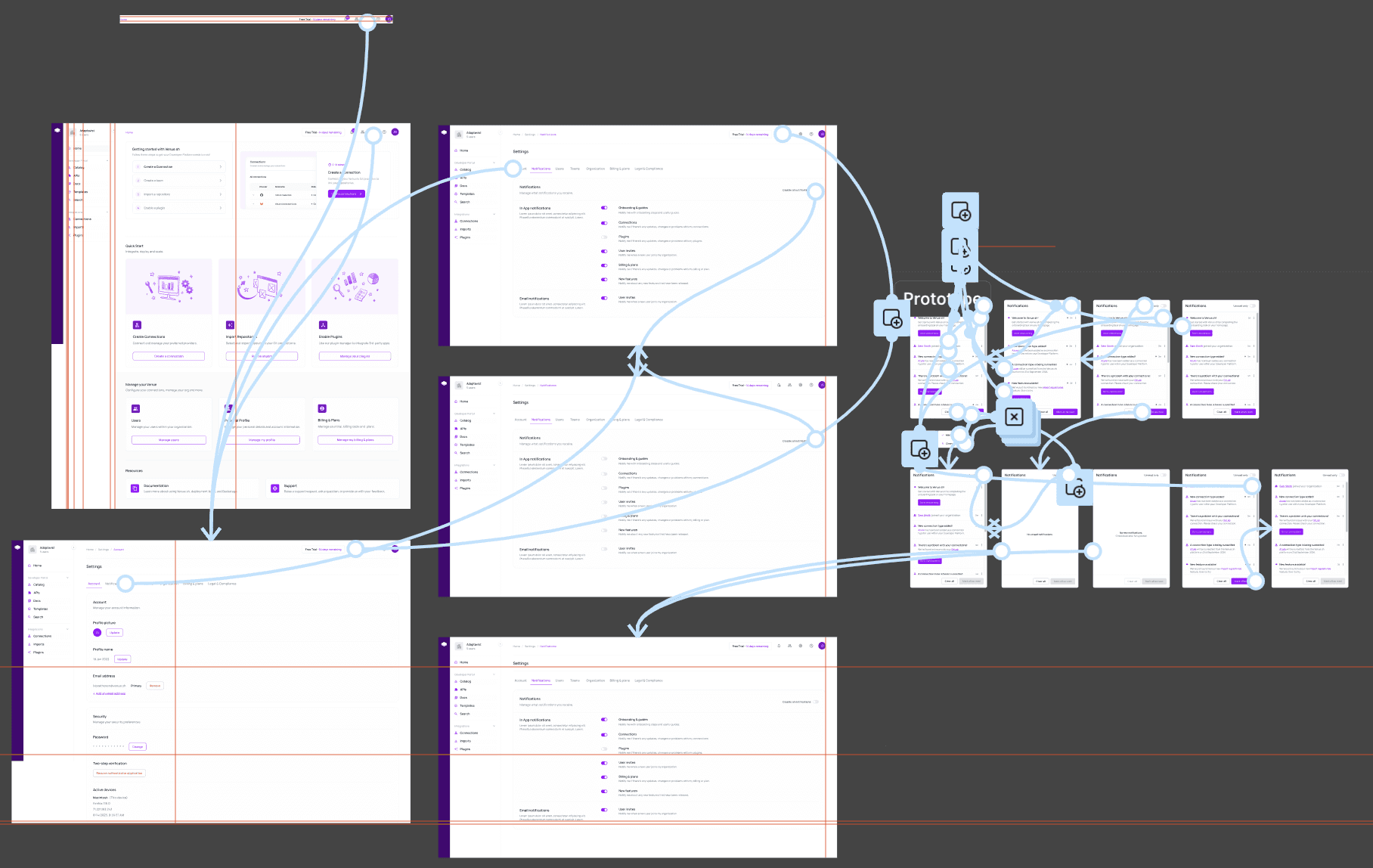
Key decisions: place the bell in GlobalHeader alongside Assistant and account menu; visible but subordinate to primary navigation; use Badge (dot vs count) per design system guidance, with accessible naming for screen readers. The panel used dense List rows; icon, title, timestamp, read/unread state - with clear empty and “all caught up” states. Settings IA was streamlined to host granular prefs without duplicating user overview elsewhere (another whiteboard gap). I designed read/unread and grouping so the feed stayed scannable at a glance, and made announcement-type notifications visually distinct from personal actionable items.
Lessons
Notifications are a trust contract with the user’s attention
The biggest lesson: every notification competes with flow state, if we surfaced low-value events, users would mute everything, including critical scorecard failures. Preferences aren’t polish; they’re core UX for an IDP serving engineers with real alert fatigue. Header real estate forced discipline; notifications had to earn their place next to Assistant and global shortcut search, which meant ruthless event prioritisation with product. Finally, in-app and Home activity feed had to tell a coherent story: one answers “what needs me now,” the other “what happened while I was away” — designing them in isolation would have duplicated confusion.